The cover that never was

I have had quite a few compliments on the cover art for Churchill and Sea Power, and I wish I could take more credit for it.
The photograph of Churchill on the deck of HMS Prince of Wales in 1941 was on the list of images I’d submitted to the publisher, so at least I can say I got the process started. This seemed like a pretty obvious choice for the book. It’s a well-known photograph with an obvious naval element. Best of all, it was available from the US Library of Congress for free. But I didn’t picture it on the cover.
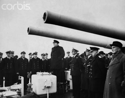
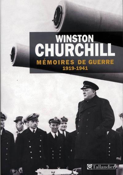
To begin with, the photo struck me as a bit too well-known. I could think of at least two or three other books that used this picture on the cover, including a recent edition of Churchill’s abridged Second World War memoirs. I also had another picture in mind – a photograph of Churchill standing below the guns of HMS Exeter addressing the ship’s company in 1940 after the Battle of the River Plate. I thought this was a particularly striking image, and one particularly well suited to the book. The Exeter’s guns, which dominated the photo, seemed to evoke the idea of power in the book’s title. But more subtly, it combined the three most prominent elements that contributed to Britain’s sea power – the nation’s civilian leaders, its trained naval personnel, and its warships.
So this was the image I suggested for the cover. And the event had been photographed from a variety of angles, so there were numerous shots to choose from. My only reservation was that this particular image had also been used once before on a book cover – where I thought it had worked extremely well. In this case, however, the book was in French, so I assumed that it would not be suffering from over-exposure in English-language bookstores.
A few weeks after submitting my suggestions the publisher sent me a mock-up of the cover. I was surprised to see they had used photo from the Prince of Wales, but it worked so well that I never thought for a second of rejecting it. The background had evidently been tinted slightly, which was a very clever thing to do. It gave the image a vibrancy that was lacking on other covers. And given the compliments I’ve been getting, I don’t think there’s any doubt that this was the right one to go with. Although on some level I’d still like to see what the production department could have done with one of the photos from Exeter.


